Amazon Prime Now
Groceries delivered, sustainably.
Prime Now was a digital platform and delivery service owned by Amazon. (RIP 2021) I added two features to the current UI that would make the service more sustainable and appeal to conscious consumers.
Role & Tools
Timeframe
2 months
2 months
Tools
Research, visual design, UI/UX design, user testing
Figma, Illustrator, Photoshop
My RoleResearch, visual design, UI/UX design, user testing
Platforms
iOS app
iOS app
Goal
For the growing number of busy, conscious consumers, how might we design a sustainable version of Amazon Prime Now?
Research
During research, I mapped out the Prime Now customer experience and researched Amazon's sustainability goals so I could create a design that works for users and the company.
Persona
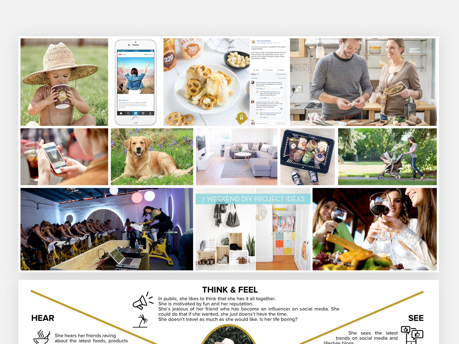
According to a study by BCG, 74% of consumers would pay more for sustainability (IMFA, 2020). The number of conscious consumers in the US is rising. This persona is based on myself and friends like me who want to make a difference with their dollar.
Amazon Sustainability Goals
Amazon has become an easy target for scrutiny from critics and consumers alike. It has been dinged for excessive packaging waste and poor worker rights, specifically, hurting its reputation in recent years.
As such, Amazon has taken to controlling its own narrative across all aspects of its business. Being proactive, rather than reactive, is in the company’s best interest.
With consumers calling on companies to give them ways to make sustainable lifestyle choices, Amazon has adopted sustainability initiatives across operations, packaging, social responsibility, and more.
Where do Heidi and Amazon's goals overlap?
Finding where customer and business goals overlap will help determine top priorities for designing a sustainable Prime Now.
Define Goal
Based on the findings from my research, my objective for this project was to answer the question, how might we design the next version of Amazon Prime Now to:
To answer this question, I looked at it in two parts. I first started with delivery and then tackled packaging waste, going through my typical process of researching, ideating, prototyping, and iterating for each.
Part I - Delivery

Competitive Research
My goal for competitive research was to learn how other companies are reducing emissions from deliveries.
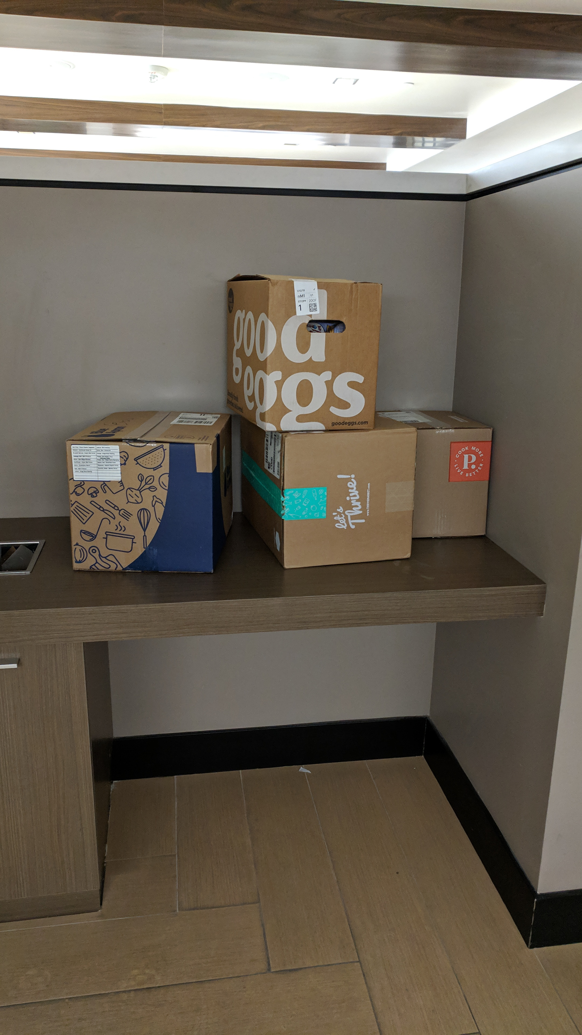
Many companies like Imperfect Produce, Blue Apron, and Farm Fresh To You deliver their boxes all at once. Imperfect Produce and Farm Fresh To You have their own fleet of delivery vehicles and have users order for a predetermined delivery time, while Blue Apron and Thrive partner with FedEx, UPS, and USPS.
Amazon has its own fleet and could handle consolidated deliveries.
Final Design: Community Delivery
Part II - Packaging Waste
Many customers complain about packaging waste, as can be seen in product reviews. There are several small zero-waste grocery delivery startups popping up across the country. Riding the wave of zero-waste living, Amazon may benefit from offering package-free goods via Prime Now. A project like this may be a moonshot, but the idea intrigued me and there seems to be a market, so I designed a potential solution.
From Linear to Circular
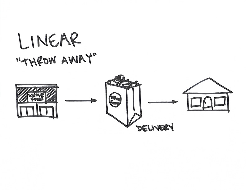
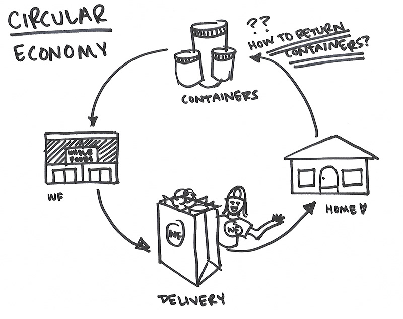
Amazon's user experience supports a linear purchase model. In order to be zero waste, packaging will have to be returned to the store via a circular model. A challenge was to design the package-free UX so it didn't disrupt the user flow that the Prime Now customer has come to expect.
Competitive Research
Several zero waste shops have popped up online recently. Brick-and-mortar zero waste shops have been successful in areas where conscious consumers are concentrated, like the Bay Area, Austin, and Europe. The rise of online shopping has made it so companies are starting to explore the opportunity digitally.
Experience with Wally Shop
Wally Shop is the first package-free grocery shop to ship nationwide. Non-perishable items come in 4 different jar sized and are shipped in a collapsable tote that can be kept until jars are empty and ready to be sent back to Wally Shop.
Wally Shop sold out of product within a few days of launching, indicating that there's an enthusiastic market for zero-waste shopping.
Competitive Analysis Takeaways
1.) Setting expectations about how the reusables program works before allowing users to shop provided the best customer experience.
2.) Deposits - Holding a deposit for each reusable container is the best way to “lease” reusables while also protecting the company's assets.
3.) Returns - Returns should be possible in-store or via pickup upon next delivery.
4.) Tracking - Users should be able to access information about what containers they have, which have been returned, and their deposit amount at all times.
New User Tasks
Based on primary research and competitive research, there were several new tasks that needed to fit into the Prime Now user flow.
Ideation
Starting with package-less items in Whole Foods stores, I ideated a user experience that would support a circular model.
How to organize the package-free items within Prime Now’s existing architecture?
To determine the most user-friendly way to build the new addition to the Prime Now store, I mapped out user flows illustrating two different scenarios.
Task flows 1 & 2: Package-free items are nested within the existing Whole Foods section.
Task flows 3 & 4: Package-free items are given their own Package Free Market, a 4th addition to the Prime Now markets.
This helped me determine which flow would require less cognitive load from the user.
Task flows 1 & 2: Package-free items are nested within the existing Whole Foods section.
Task flows 3 & 4: Package-free items are given their own Package Free Market, a 4th addition to the Prime Now markets.
This helped me determine which flow would require less cognitive load from the user.
USER FLOW
WIREFRAMING
Prototyping
I used Figma to prototype my design and test it with potential customers.
Usability Testing
I tested my design with 4 people, aged 21-35, who had all ordered food for delivery before.
I recorded my user testing observations and distilled them into actionable insights using the 6 mental processes from Design for How People Think by John Whalen.
Key Feedback
• Use coach marks to communicate important information and actions more successfully than the onboarding carousel, which is easy to ignore.
• Send a push notification when delivery person picks up jars to confirm receipt, creating trust.
• Add moments of delight when major actions have been completed to incentivize the user to continue use.
• Sell items by jar count and size, which are a more well-recognized unit than weight.
Final Design
What I learned
• When designing a new feature, other parts of the user experience may need to be redesigned as well to make the user experience flow.
• Use images and animations to show the user something, rather than telling them.
• During early usability testing, make sure people are in a non-distracting environment to get the best insights about fundamental usability.
• Test with your target customer. Especially for new concepts like this, testing with users who have intrinsic motivation to complete the tasks at hand will give you higher quality feedback than testing with someone who doesn’t. They will be willing to work with you to perfect the task flow before rolling it out to a larger audience.

