August
Order directly from local farms.
August is a responsive web app where people can buy food directly from small farmers. Many people want to buy fresh, local food but don't know where to find it. August aims to solve that by making it easy for people to order directly from small farmers in their area.
This app is a work in progress. This project shows the fourth iteration of design and operations since launching our delivery service at the beginning of the pandemic. Read on to learn the story!
Project Type & Involvement
Timeframe
2 months (Design only)
2 months (Design only)
My Role
Research, visual design, UI/UX design, user testing
Research, visual design, UI/UX design, user testing
Platforms
iOS, Android, Web
iOS, Android, Web


The Story
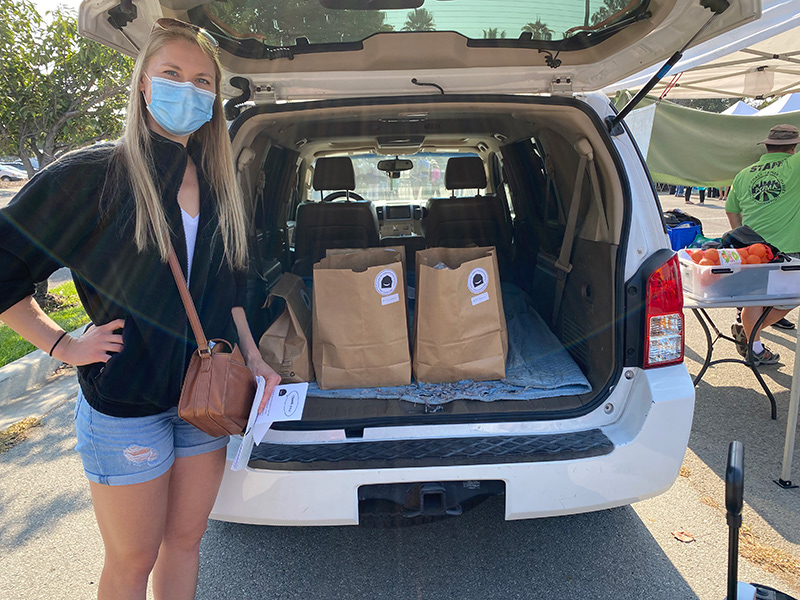
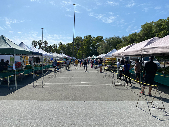
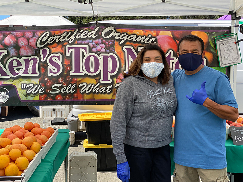
At the beginning of the pandemic, Alex Rosandick and I started delivering groceries from our farmers' market to our neighbors to help out. There was nothing left at the grocery store and it was nearly impossible to get a delivery from Instacart or Prime Now. Yet, small farmers at our market stood strong and had an abundance of beautiful produce.
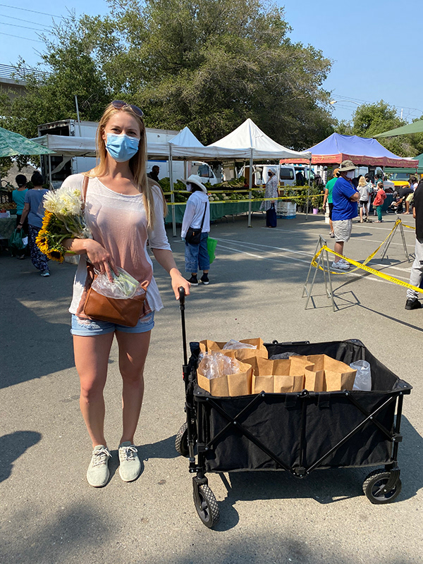
We created an order form with all of the items at the market on Google Sheets and sent it to our neighbors. We bought a wagon on Amazon and started doing deliveries from the market, rain or shine, hot or cold. The gratitude from farmers and neighbors alike lit a fire within us to connect more people with local food.
We turned our service into a company and built a Square site to reach our greater community. Through word of mouth and a few marketing efforts, we reached more people, but there were hours of manual work involved each week to sort through lists and double check orders. We tested and iterated many different operations, and learned that the only way to make our work manageable would be with technology, but that technology didn't exist yet!
We set out to create Instacart for farmers markets, but after digging deeper into the numbers and operational requirements, we decided it was time to pivot.
This project explains our work since the pivot.
Problem
• 73% of people in the US are actively trying to eat more local food.
• 51% of people don't know where to buy local food because it's not adequately marketed.
• 51% of people don't know where to buy local food because it's not adequately marketed.
After doing local grocery delivery and talking with so many people who want to buy local food, we knew we were solving a problem people deeply cared about. But after failing to make our operations profitable, we knew we needed to adjust our place in the equation.
Research
Our goal is to design an app that makes it easy for people to buy food directly from local small farmers, taking our physical operations out of the equation. The questions we wanted to answer during research were:
• How do most people want to buy directly from farmers?
• What are the pain points with buying directly from farmers?
• How can we support direct sales without our own operations?
Survey
We surveyed 200+ women who have bought local food, asking, "For those of you you want to buy directly from farmers (from CSAs, farmers markets, etc.) but don't on a regular basis, why don't you? The most common reasons were lack of customization, not convenient enough, and don't know where to find it.
Interviews
I spoke with 10+ people who had responded to our survey, along with a few colleagues who had bought local food in the past. All of the interviewees either didn't know where to get local food, or they were too busy to do it themselves. They all wanted the freshest ingredients and to support small farmers.
Questions I asked were:
• How do you usually buy your groceries?
• How do you decide what to buy?
• How does food shopping typically fit into your week?
• What are your biggest pains with buying local food?
• How do you decide what to buy?
• How does food shopping typically fit into your week?
• What are your biggest pains with buying local food?
Buying Direct
There are a number of ways to buy food directly from small farmers, none of which are as convenient as going to the grocery store. We're focusing on CSA boxes, which are basically subscription produce boxes from a farm. The reasons we're focusing on CSA boxes are:
• Many small farms across the country offer CSAs.
• Based on our user research, people find CSAs to be the easiest way to get local food.
• There is not yet a marketplace where people can easily find and buy CSAs.
• We can solve user problems in a profitable way--without our own operations.
• Based on our user research, people find CSAs to be the easiest way to get local food.
• There is not yet a marketplace where people can easily find and buy CSAs.
• We can solve user problems in a profitable way--without our own operations.
Challenge: Defying Mental Models
Buying a farm box directly from a farmer defies the standard online shopping user flow. We aimed to create a user experience that would solve these challenges while working with the expected online shopping framework as closely as possible.
Competitive Research
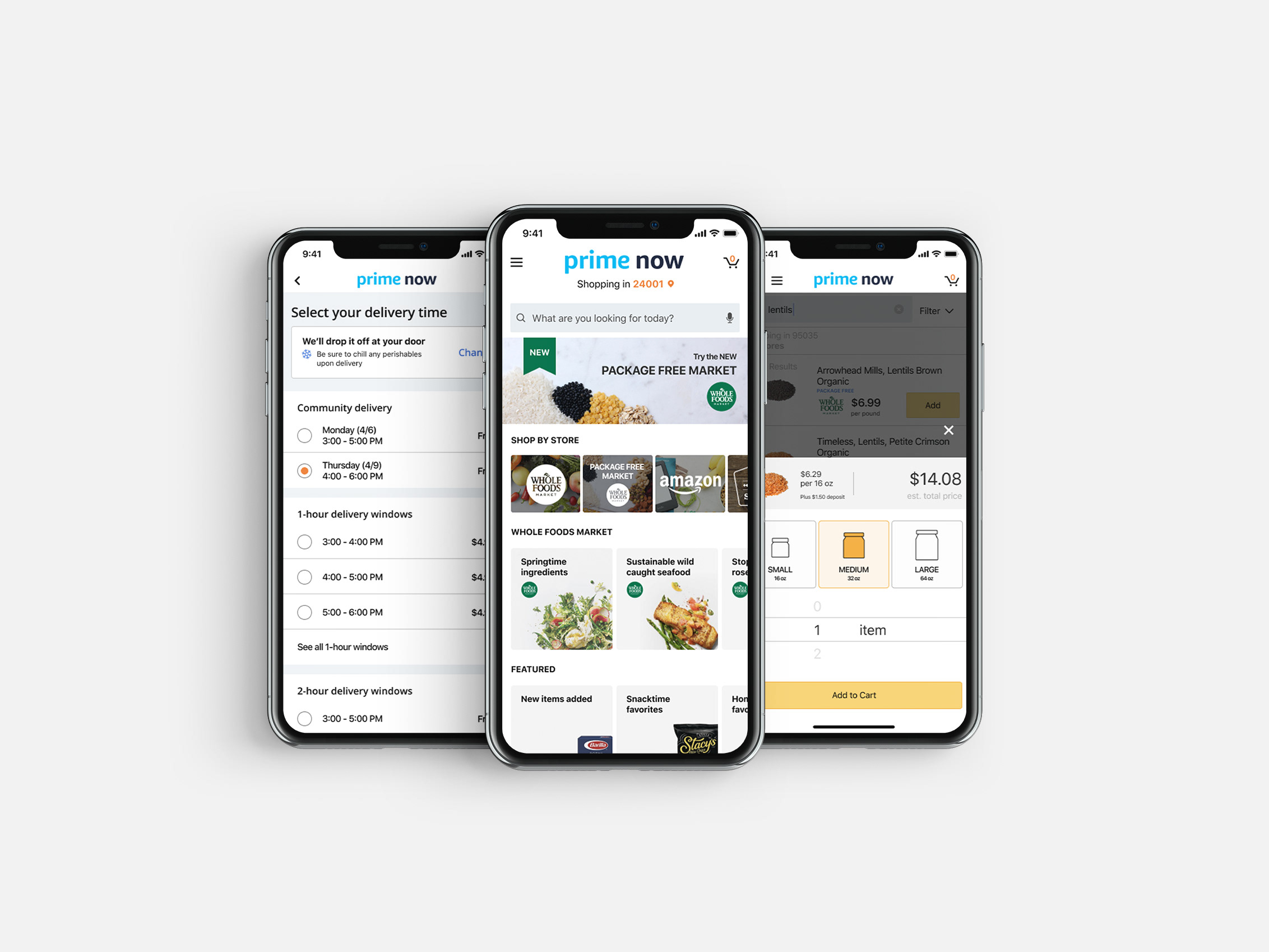
We explored how companies are solving the same or similar problem. The biggest differences were in convenience (how far out of the way the user has to go to get their food) and user friendliness.
Ideation: Building from Scratch
Because I was designing from scratch, I started ideating by creating a conceptual model that would inform the UX design before diving into sketching and wireframing.
Conceptual Model
To create the conceptual model, I analyzed what "objects" the user needed to interact with in the app, and what actions and attributes are associated with each.
I then prioritized object-action pairs based on their frequency of use, their importance to the user, and their financial importance for our business.
Customer Journey
I quickly mapped out a high-level view of the customer journey, associating object-action pairs with their phase(s) of the customer journey.
Quickly ideating this way allowed me to brainstorm functionality beyond the conceptual model that would elevate the user experience.
User Flow
From the customer journey, I created a user flow map for buying a farm box.
Wireframing
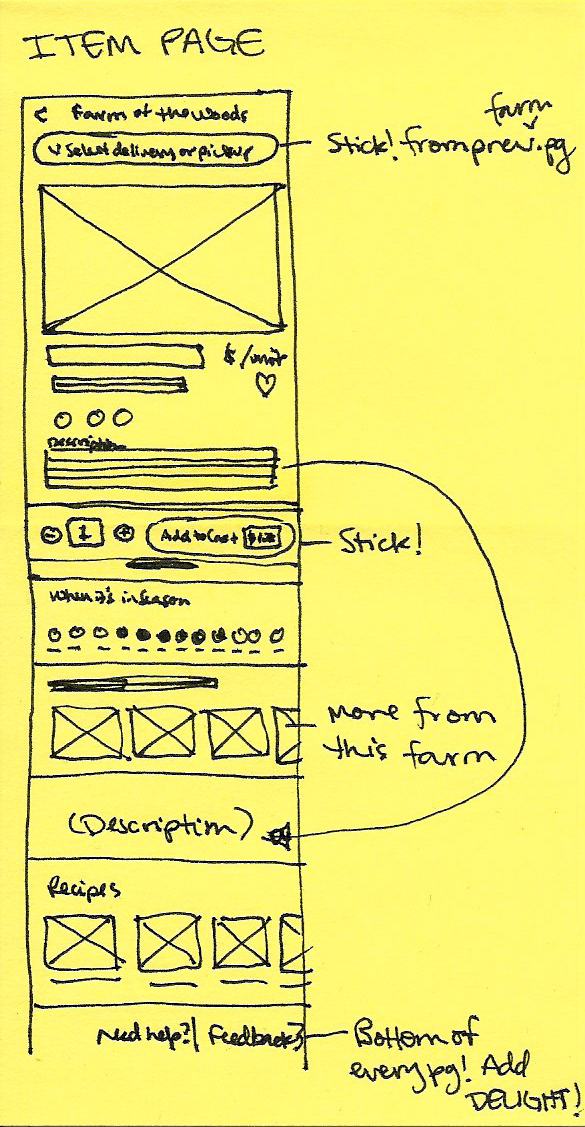
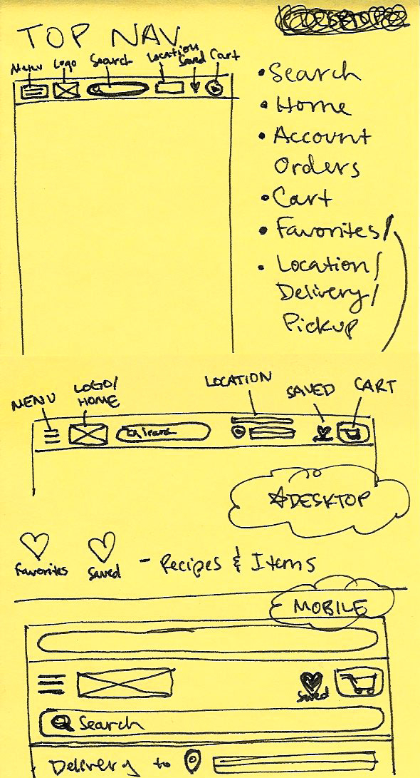
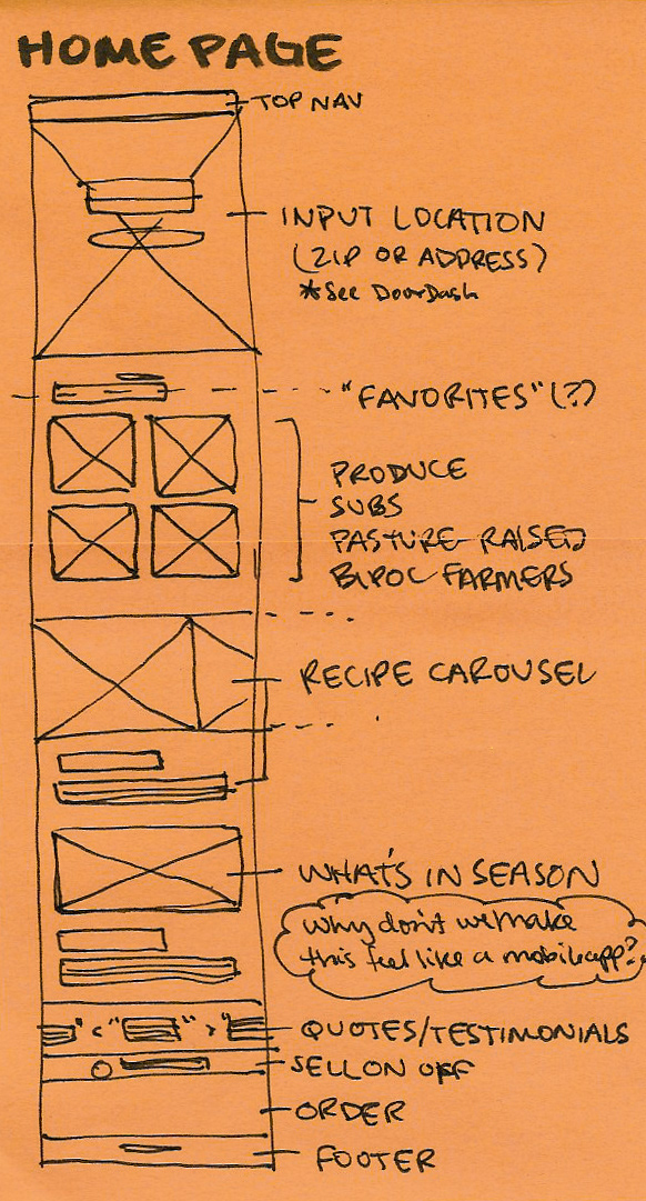
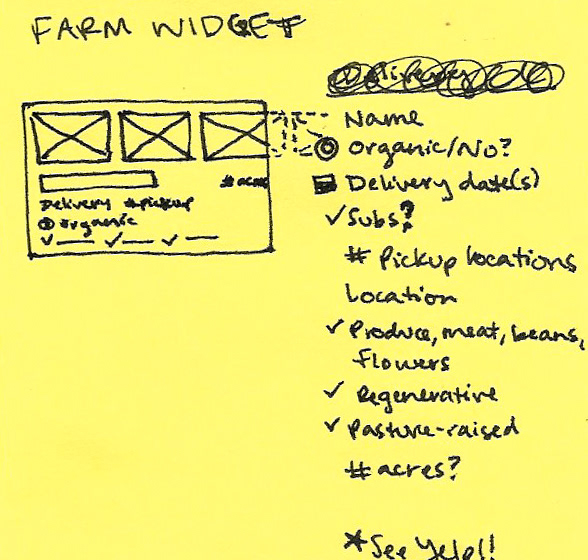
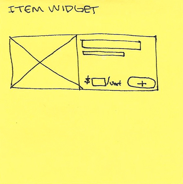
Through several rounds of sketching, I iterated wireframes to work through the challenges of ordering directly from small farmers. Our customer experience would defy traditional online shopping mental models in some ways.
Prototyping & Testing
Through testing and iterating the design 10 times, we changed the parts of the interface where users experienced friction in completing their goals.
Design System
Combining bright colors brings new energy to local food, which is often thought of as "crunchy," grassroots, and homegrown. We designed a brand identity that can hold its own against Instacart, Shipt, and other major brands.
Final Design
View a demo of the final product, or scroll down a bit further to view an interactive prototype! It's a work in progress that will be updated as we make changes.
Defying Mental Models
As mentioned previously, buying a CSA box directly from a farmer defies the standard online shopping user flow. To create a user experience that would solve this challenge, we mapped out all of the possible user scenarios when ordering a box, particularly edge cases. We then designed components that would communicate to users only the necessary information to help them make their decision, which would reduce cognitive load.
Next Steps
We will continue testing the design to learn what improves the customer experience, improves retention, and increases purchases.
We are also developing the farmer side of the app. Since farmers aren't typically inclined to use technology, it's an exciting challenge to create a design that fits into their lives and that they want to use on a regular basis. We've developed relationships with many farmers around the Bay Area and are grateful to be able to serve them!
What I Learned
The three biggest lessons I've learned during this project so far are:
1.) How important it is to test early and often in order to learn what works and what can be improved.
2.) Gathering insights from multiple sources during research and user testing gives more holistic feedback about what to build.
3.) The power of leadership to enroll people in your vision and get things done.
